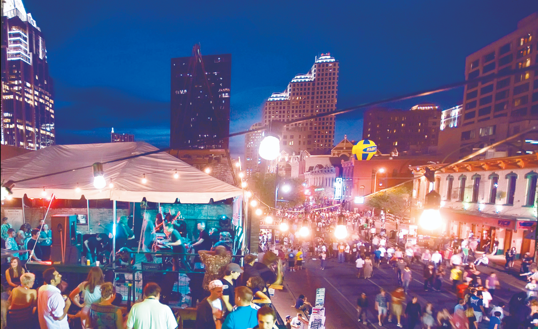
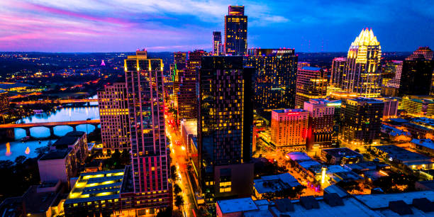
The People of Austin
When telling the story of a city, start with the people.
Summary
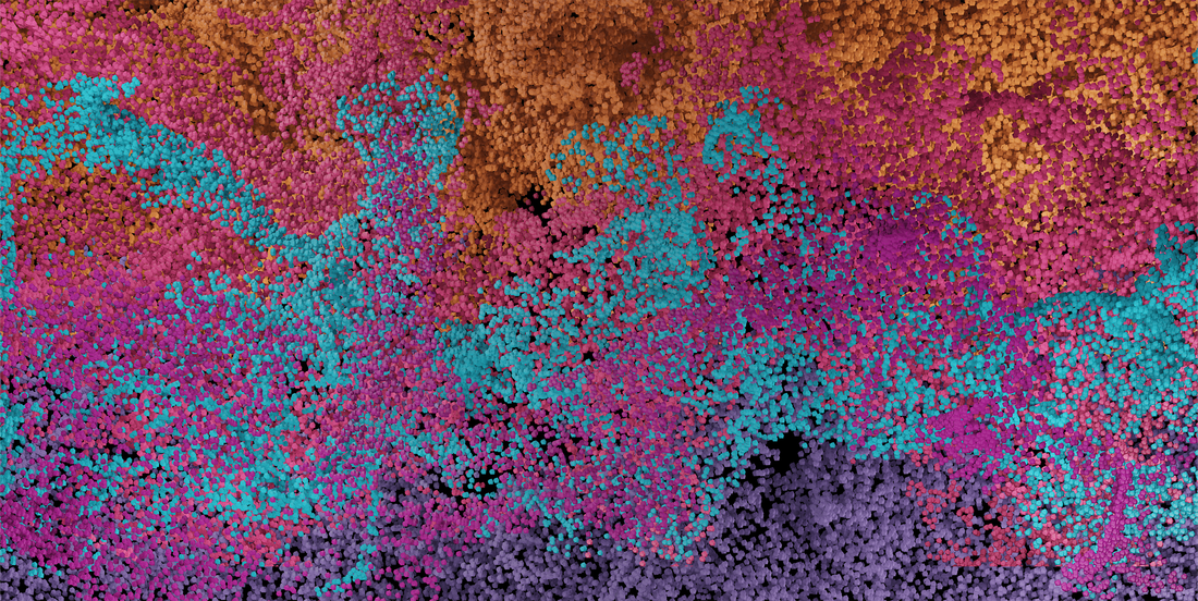
The People of Austin is a visualization of data relayed through one uniquely activated particle system with shifting colors.
Description
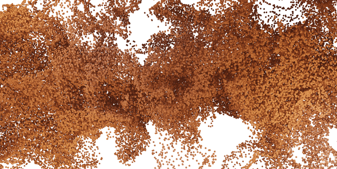
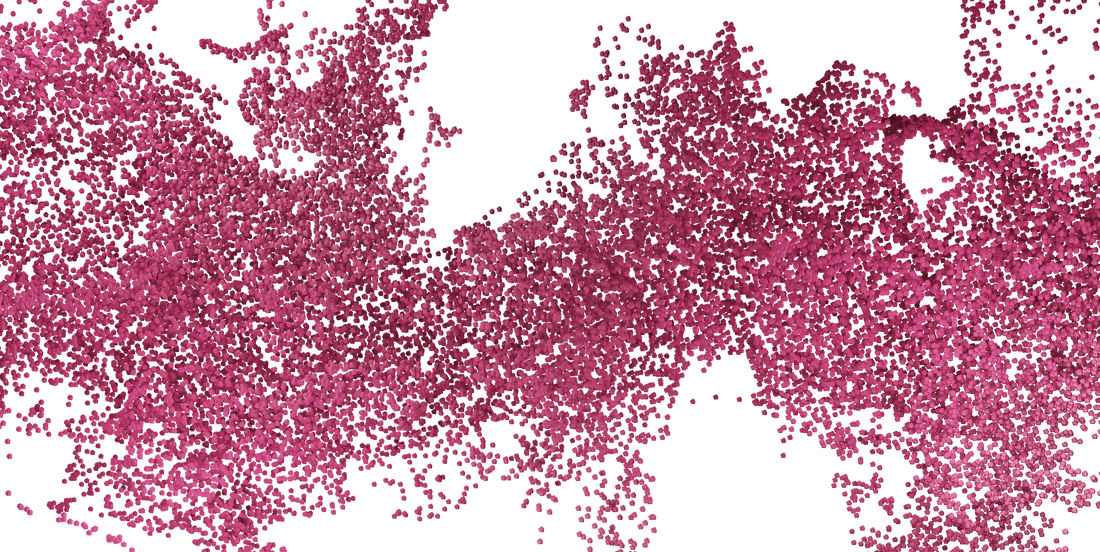
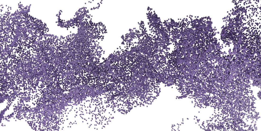
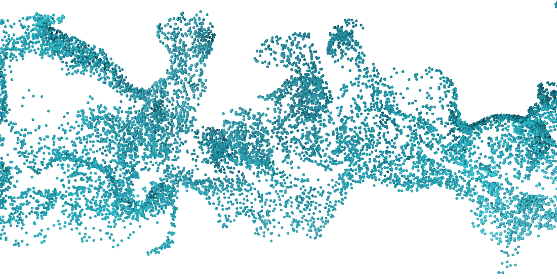
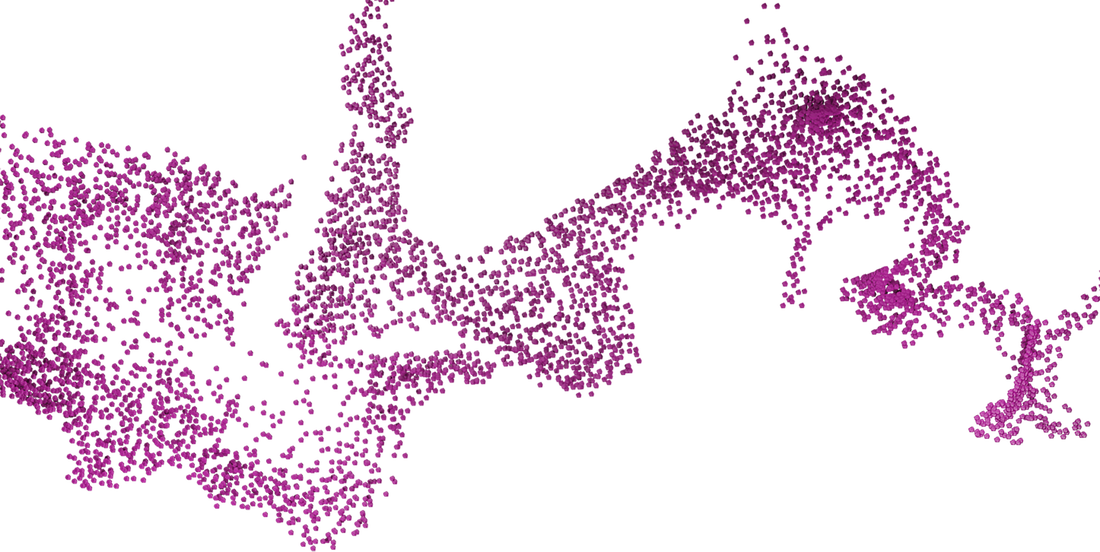
Utilizing data of Austin, we are creating one particle system in Blender to represent the entirety of the population, and then using different colored lights to represent the various aspects of the city. The colors include: magenta for live music events, light blue for business establishments, purple for tourism, pink for art events, and orange for the population. Our idea is that these particles represent the people of Austin and their interests, and seeing them flow around together symbolizes the unity connecting the inhabitants of the city.
Meet "The Scientists"
|
Luis Angeles gathered data on Austin and provided background mockups.
|
Angela Medina gathered data on Austin's total population and built the base particle system.
|
|
Max Truty gathered data on Austin and has documented the team's efforts.
|
Sanchi Sinha gathered data on Austin and provided background mockups.
|
Process
Our initial pitch was to use various data of Austin in a multitude of graphs overlaid to create an abstract montage. This idea was rejected. The revised pitch, and the one we are currently following, uses a particle system to represent Austin. To create the particle system, Angela watched a YouTube tutorial on how to make it in Blender. Following this tutorial, she made changes to suit our project's vision and needs.
These pieces were part of our original inspiration to create an animated data visualization video centered on Austin. Our concept has developed since the start of the semester, but the core of our project remains the same.

Our original concept was to create various types of graphs and charts to visually represent data of Austin. This was a simple proof of concept. This idea was rejected.
Feedback: As a caution – this feels like it could get too literal. The intent is to create a stunning piece of art – not communicate a message, per se. Our recommendation is to explore a concept less focused on If this is pursued further, we’d like to clearly understand the data set and how that will drive the content The visuals need to be crisp and sophisticated – the bottom left mood board image is close – we don’t want anything that looks like the other examples and for sure no charts/graphs. Will this loop? Would love to hear another idea, just to compare.
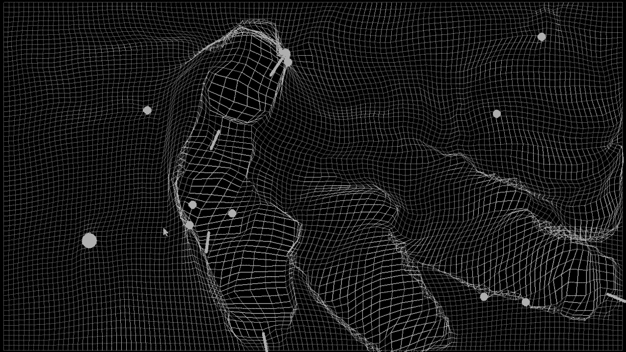
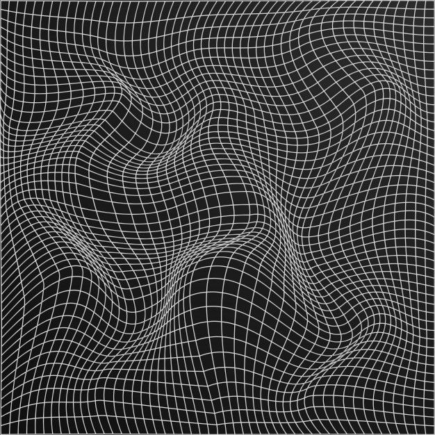
We want to stay away from the wireframe look. It’s been done and skews cliché with architects. Something representative of structure and/or structural components but communicated with other styles/shapes/etc. could be an option. In general, it sounds like group 2 is going too literal – let’s push for less literal, more abstract.
We want to stay away from the wireframe look. It’s been done and skews cliché with architects. Something representative of structure and/or structural components but communicated with other styles/shapes/etc. could be an option. In general, it sounds like group 2 is going too literal – let’s push for less literal, more abstract.
In our original mockups, we planned on encapsulating all the data and particles within a 3D prism of Austin's city limits. These are various angles we proposed from this concept. We thought this prism could further represent the city and all that goes on inside, however, it felt too constraining, and we were told it resembled a petri dish. So, we moved forward and removed the prism altogether.
Feedback: We have some existing particle-based content – our preference is something different/not particles. If a non-particle concept isn’t possible, the general direction/explanation sounds good. Considerations include color palette, movement, use of 90-degree return, size of particles, speed, etc.
As-is, this does not work – it’s too science/petri-dish looking. The forms/spheres should have lots of variation in size – not all the same. Color palette is nice. Consider NOT constraining yourselves to the bounding box of the city outline but allowing more organic flow.
As-is, this does not work – it’s too science/petri-dish looking. The forms/spheres should have lots of variation in size – not all the same. Color palette is nice. Consider NOT constraining yourselves to the bounding box of the city outline but allowing more organic flow.
This is a compilation of our team learning how to make a particle system using Blender and Angela's experimentations based on the YouTube tutorial she watched.
Feedback: Will multiple colors/gradients be explored? The piece will be stronger with multiple colors and/or transitions/fades/gradients Scale and speed will be critical on our large wall – as of now, speed seems too fast – would recommend creating a few stills to send us we can test for you. Right now, the piece plays and then reverses back to the beginning – ideate on how to more seamlessly loop without reverse. What is the significance of the pattern/flow/shape the particles take/follow?
Our initial idea was to use a color palette with varying shades of purple with different shades representing different groups within our dataset. After receiving some feedback, we decided to use a sunset color palette in order to bring a wider range of colors to our piece. These different colors represent different aspects of Austin. This includes a magenta for live music events, a light blue for business establishments, a purple for tourism, a pink for art events, and an orange for the entire population. The pinks of music and art represent how lively they are, the blue for business is for all the blue-sky ideas emerging in Austin, purple originally represented the color of the bats raised in Austin but we chose to use it as a representation of tourism in the city, and orange symbolizes the warmth of the community.
We planned on combining five individually rendered particle systems using After Effects to showcase the variety and uniqueness of Austin. However, we ran into problems regarding file size and were unable to continue down this route.
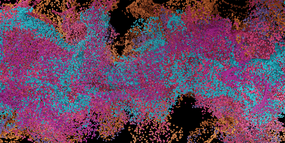
Although we were unable to use the separately made renders, we took inspiration from them when creating the single particle animation and attempted to incorporate the colors and dimension that multiple particle systems would create all in one particle system.
In order to make the piece more engaging, we considered adding a background. We created a few mockups to test how the piece would look with a background, but ultimately felt the background took away from the particle animation instead of enhancing it. We ultimately decided it was more engaging without a background.
Since we were unable to combine the five individual renders, we decided to create a single particle system that still holds the project's meaning. We used five lights of the same colors of the individual renders to keep the symbolism they held in the previous versions. We tried looping the particles internally in Blender but that did not work for the particle system we built. Instead, we duplicated the animation and reversed the second video in Premiere Pro to loop the animation.
Feedback: Your file does not play on the DXD screen. Please check the specs.
The file was too large for Gensler to test. Can you make it smaller, ideally under 3 GB?
Gensler got the last video you uploaded to play but it’s very slow and choppy.
This looks like a problem with the H264 – MPEG-4 encoding. The team will need to re-encode the video as either Hap or Notch.
Could you make the colors move? It's a bit too still having the colors stay in the same place and making them shift would make the piece more engaging.
To make the piece a bit more activated, we decided to make the light colors shift over time. We feel this makes the piece a bit more engaging, as the shifting colors in conjunction with the moving particles create a soothing animation that is satisfying to watch.
Feedback: MUCH better, although the particles are a weird shape (faceted) and grainy-looking up close. Movement is much better and color shift looks great.
After several iterations, we were able to land on an abstract animation that we felt strongly encapsulated the theme of ‘Unity’ in Austin while also aligning with Gensler’s mission to deliver engaging and connected environments.
Feedback: The particles look better as spheres. The color shifting is nice. In general, there’s not a lot of movement/interest in this piece, though. For the most part, the particles stay in place and seem to “pop” in and out vs. move around. It would be nice if there was flow/movement.
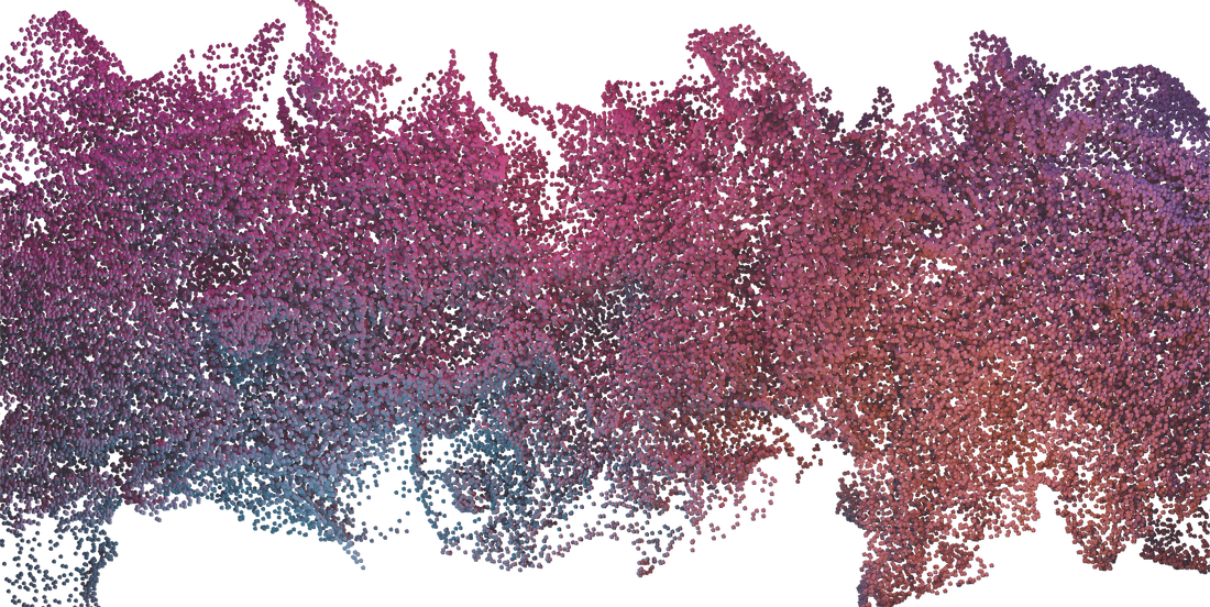
This is a snippet of the final animation on Gensler's lobby screen.
Our Last Thoughts
Luis: I enjoyed working with my team in the creation of this project. I felt like we had a lot of ideas in the beginning and in the end we kind of combined a few which led us to this result of the particle system. I didn’t have any experience working with Blender prior to this project so I felt very lost and stuck when trying to render some of the particle systems but my team was very supportive and helpful so I was able to do my part!
It was very exciting to see this particle system change over time into what it is now. I am very happy with how it looks like and I honestly wouldn’t change anything about it! It’s very pretty, colorful, interesting and detailed and most importantly it has a deeper message. We are representing our lovely city of Austin and the people in it. That is one of the things that I love the most about this project.
It was very exciting to see this particle system change over time into what it is now. I am very happy with how it looks like and I honestly wouldn’t change anything about it! It’s very pretty, colorful, interesting and detailed and most importantly it has a deeper message. We are representing our lovely city of Austin and the people in it. That is one of the things that I love the most about this project.
Angela: There were so many downs throughout this project. First, we had to create concept after concept after they were all rejected. Then, once we had our final concept approved and we started production, we ran into file size and video codec issues on top of criticism of the animation and trying to iterate. However, once the technical issues were resolved, we were able to focus on the animation's content. I spent hours rendering endless trials, at times with very little change between them, but it was all in the name of creating the best version we could possibly make. I'm very happy with our final animation and all I've learned from this working on this project.
Max: This was a very fun project. There were a lot of hurdles that we had to overcome, such as learning a new software with our decision to use Blender. We had trouble at times with file sizes, but we learned a lot about Blender and working with a customer as we iterated our project over time. This was a great learning experience, and I enjoyed every minute.
Sanchi: This project was very exciting for me since it required me to think very differently. Everyone in my group has different interests and we were able to combine them to come up with the idea of representing data in an artistic way. Coming up with initial ideas for what we want the project to look like required a lot of research and trial and error, until we settled on a particle system. Throughout this process we looked for inspiration, created rough mock-ups and discussed several ideas. We also ran into several technical issues which we did have to try and solve as a group or ask other classmates for advice. My favorite part about this project was actually being able to work for a client. I have some experience with brand design so to be able to transfer those skills and learn more about working for a client was very fascinating.
